Splitwise
Redesign
- Methods: Usability Study, Research, Wireframing, Prototyping
- Tools: Figma
- Duration: 10 hours
- Project Type: Individual Design Challenge
What is Splitwise?
Splitwise is a mobile app that splits expenses with friends, roommates, group trips, etc. It simplifies debts so you only have to pay back 1-2 people at the end of all the transactions instead of paying back every single person. It can split expenses evenly between everyone or unevenly and also calculates group totals. It includes some integrated payment options like Venmo in pro subscription and many more features.
Usability Study
My first step to redesign this app was to do a usability analysis of the app since I had already used the app before and was familiar with its functionalities and navigation. Through this analysis of some of the main screens, I was able to identify some usability issues and pain points.
Google Reviews
For my next step, I decided to do some research using the modified fly-on-the-wall technique where you observe what people are saying about the product by looking at public forums and blogs. I did this by looking at the app reviews on the Play Store which provided a lot of insight since it had over 100K+ reviews. I then grouped similar reviews and categorized them based on their pain points.
Pain Points, Needs, and Wants
Based on the research above, as well as my personal use, I created a list of pain points, needs, and wants of the users using this app to define the problems.
Competitive Analysis
I did a competitive analysis by looking at 3 other apps that are similar to Splitwise and comparing their features, tasks, visuals, flow, etc. Through this table, I was able to find certain things that these competitors had that Splitwise did not as well as what Splitwise had that these competitors did not.
Affinity Mapping
Using the research and insight from above, I complied them and grouped similar ones into themes. This helped me brainstorm and develop potential solutions. Under each theme in orange, are pain points in yellow sticky notes and potential solutions in blue sticky notes.
Wireframes
Next, I sketched out some wireframes by hand of some of the main screens I wanted to showcase because of the limited time I had. I also looked at competitors to see if there were things that could be advantageous to this app. In the end, I sketched out the wireframes below of 4 main screens.
Final Prototype
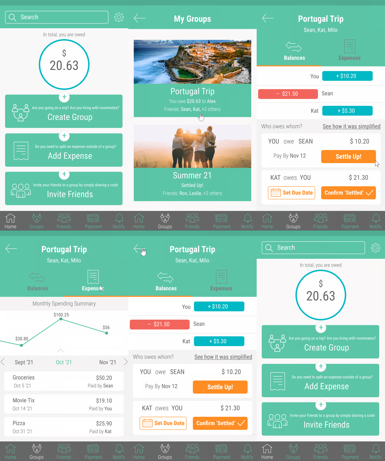
Finally, I created the 4 main screens from the wireframes in Figma, changing the style and screens of the existing app while keeping the brand colors. A clickable prototype was also made. While there are many more additions and changes that can be made and implemented from the afffinity map, I decided to focus on these 4 screens in the time that I had.
Clickable Prototype
