uRecycle
- Methods: User Research, Prototype Development, Usability Testing
- Tools: Figma, Mural, ReactJS
- Duration: 8 months
- Project Type: Group
Context
In 2019 alone, the University of Waterloo (UW) sent approximately 3,028 tonnes of waste to landfills, which equates to a waste diversion rate of just 33.2%. When compared to other institutions, this rate is relatively abysmal. For example, the University of British Columbia is on track to achieve an 80% waste diversion rate in 2020, despite having nearly 10,000 more students at their Vancouver campus than UW. The Office of Sustainability developed a Zero Waste Action Plan in 2017, with the goal of achieving a 90% diversion rate on campus by 2035. The efforts on this front are primarily infrastructure based, such as implementing a receptacle standard for recyclables and organics. These changes are a great start, however, they fail to acknowledge issues with human behaviour that lead to the generation of such large amounts of waste.
Objective
The objective of this project is to tackle the problem of waste diversion by changing human behaviour with respect to recycling. Through the use of existing technologies, such as object detection and web mapping services, uncertainty can be removed from the recycling process. Furthermore, by making use of a customer loyalty program, and rewarding those that make sustainable decisions on campus, people will be more likely to abstain from their convenience based behaviours and deconstruct their pre-existing biases towards recycling programs. This was a fourth year design project by my team and I.
User Research & Analysis
User Questionnaire
To better grasp the relationship target users currently have with recycling on campus, a user questionnaire was created with the goal of understanding user motivations as well as user knowledge of recycling practices. The survey consisted of 15 questions in which 10 questions focused on gathering information about current user behavior and motivation, 3 questions tested user knowledge of how to correctly dispose items, and 2 questions asked about user demographics. Questions were formulated using previous problem space research and researching existing university/college recycling survey questions to ensure unbiased phrasing, particularly a study done by students at the University of Northern Iowa. The survey was created and distributed using Google Forms and was sent to current university students and alumni.
The top two reasons for 68.3% of users for not recycling was a lack of knowledge as to what can and cannot be recycled, as well as the inconvenience in finding a nearby recycling bin location.
In terms of user attitudes and behaviours towards recycling, it was found that the majority of users try to recycle as much as possible or at least when convenient. One aspect from the results that stood out was that only 6% of respondents said they always sorted multi-material items like coffee cups before recycling, which indicated that sorting items is not a typical user behaviour. However, the results revealed that users do highly value sustainability, with 86% of users being highly concerned for the environment. When asked to rank their reasons for recycling from most important to least important, social responsibility and conserving resources were the two most important reasons for 100% of respondents. Making money through incentivization was also selected by a significant number of users, which implies that rewards would encourage users to behave sustainably. The top two reasons for 68.3% of users for not recycling was a lack of knowledge as to what can and cannot be recycled, as well as the inconvenience in finding a nearby recycling bin location. The lack of knowledge users had around recycling was reinforced by the questions that tested user knowledge, which if asked a fountain drink cup, plastic straw, and coffee cup would be recycled. 74% of users incorrectly sorted the fountain drink, 46% of users incorrectly sorted the plastic straw, and 48% of users discarded the coffee cup incorrectly.
Expert Interview
Having based our problem research on data gathered by the University of Waterloo’s Sustainability Office, we booked an interview with its Director, Mathew Thijjsen.
Questions asked:
- What improvements, if any, has the university considered for addressing sorting processes for contaminated waste streams?
- Has the university considered using smart bins for automatic sorting and/or data collection?
- How are sustainability-based incentive programs, such as the reusable cup discount at coffee shops, implemented? How do you measure their success?
- Is there any more detailed data on UW’s issues with waste diversion and contamination?
Insights received:
- UW’s waste contamination data is mostly anecdotal
- UW pays a recycling rejection cost to Waste Connections for shipments with significant contamination
- Previous efforts to address problems of waste diversion with signage have not had statistically significant results
Competitive Analysis
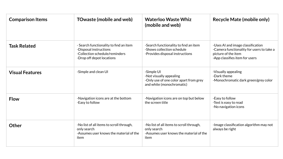
We found existing solutions to the identified problem and performed short demos of each one to find strengths that could be incorporated into our interface, as well as weaknesses that should be avoided. The chart below compares the existing solutions.
User Personas
Personas provide in-depth details of intended users, and can be unbiased to inform design requirements. Based on the interviews and surveys detailed earlier, we developed a persona of a primary user named Farhan.
Usability & UX Goals
The 3 usability goals defined for our product were the following: effective to use, easy to learn, and easy to remember how to use.
Effectiveness, as it pertains to usability, will be measured by the time it takes for a user to complete defined tasks, as well as the number of users who return to the app after initial use. The second usability goal can be measured by the user's error rate while learning the app, that is, the number of errors made for each task performed within the app. The app also needs to be easy to remember how to use so that users return to the app and already know what to do, making it faster for them to complete the task. This will be measured by the error rate when a user repeats a previously learned task.
The protocol for establishing UX goals involved using the Microsoft Desirability Toolkit, which is a tool designed to measure one's attitudes toward a user interface by using a list of positive and negative reaction words. We made lists of both desirable and undesirable reactions to obtain from users testing the product. The top three positive words we wanted to hear from users were: simple, supportive, and motivated. The top three negative reactions we wanted to avoid hearing from users were: complicated, obstructive, and uninterested.
Prototype Development
Design Sprint
The next step was to start brainstorming and designing solutions. In order to generate many potential solutions while ensuring that each group member can contribute to the design, the team opted to make use of the Sprint method. A remote whiteboarding platform called Mural was used in order to conduct this process remotely. Once sketches by each individual in the team were completed, each of them were critiqued and voted on by the individual team members. The components of each sketch that received votes, and were feasible to combine, were developed into a low-fidelity prototype the following day. The team ultimately chose to create a mockup of a mobile app with an accompanying tablet app.
Features of the App
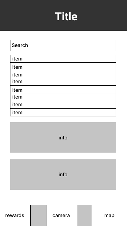
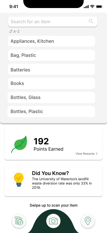
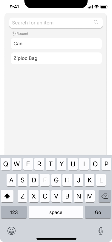
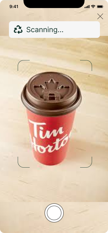
On our homepage, we wanted to give users the option of either using the camera to scan the item, the sorting list from UW's website, or the search bar, to determine where their waste should go.
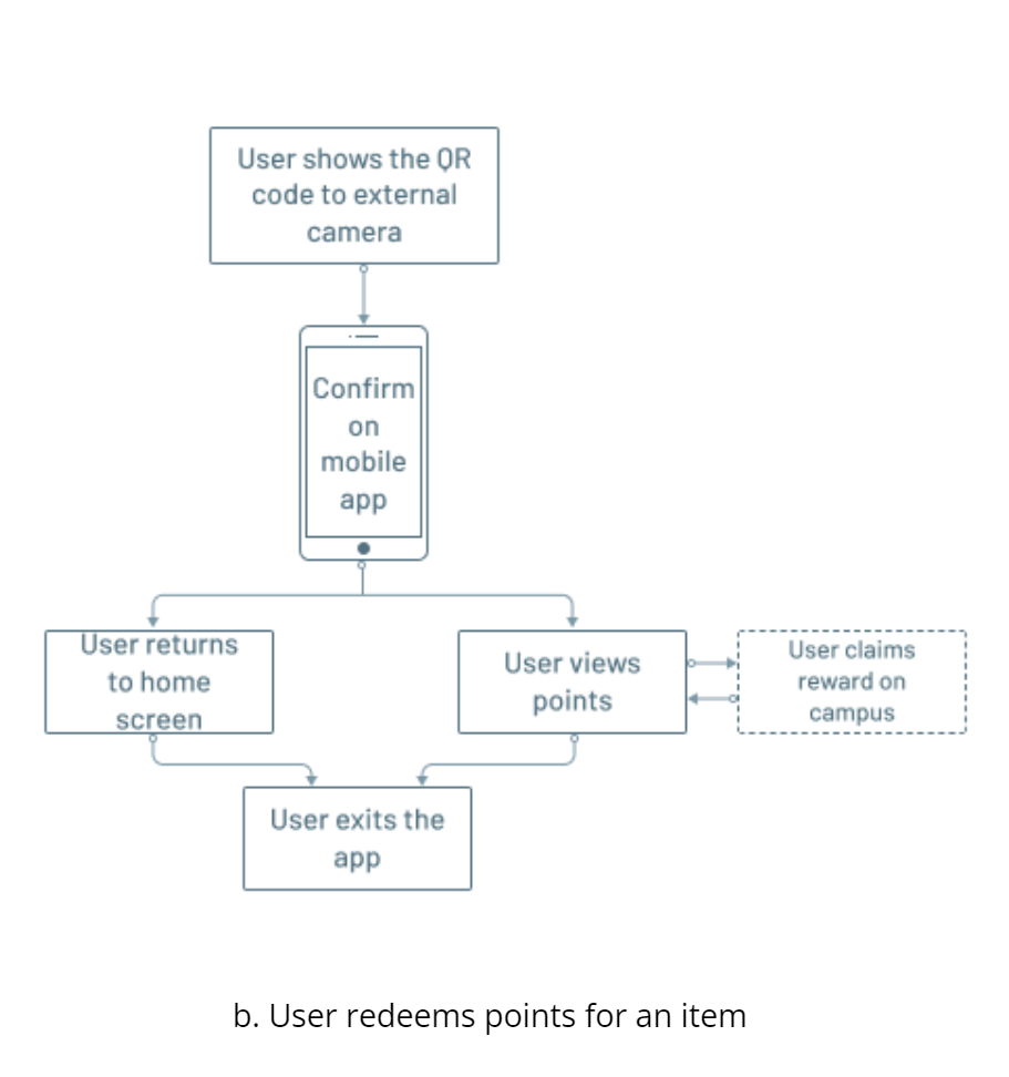
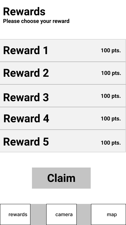
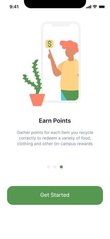
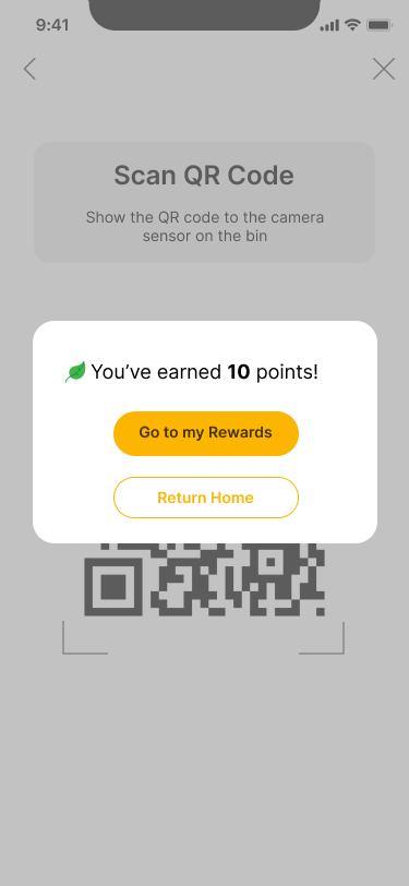
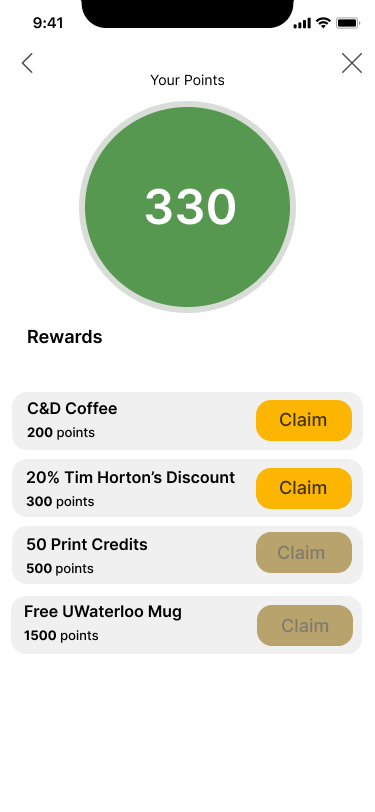
Incentivization was an important component we wanted to include in our app to encourage users to actually use the recycling app. To ensure people act in good faith, we decided to design the prototype to interact with a camera sensor on the bins and have users show a QR code generated from the app to said sensor to earn points.
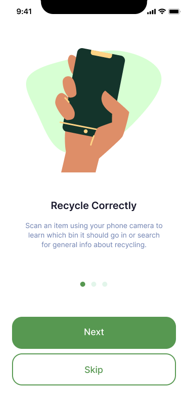
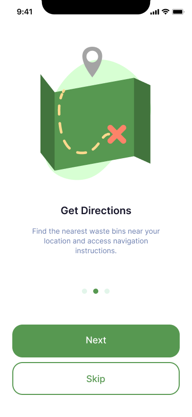
Onboarding screens explaining the main functionality of our solution were added to the prototype in order to test its effectiveness in the user testing session.
After learning that users generally have a gap in knowledge when it comes to sustainability on campus, it was important that users were shown important information on the home screen of the application. Users also mentioned that their own recycling habits are typically driven by a care for the environment and social responsibility. This resulted in the addition of a "Did You Know?" card, which shows users a fun fact or piece of information regarding the University of Waterloo's sustainability goals and general information related to global warming and climate change.
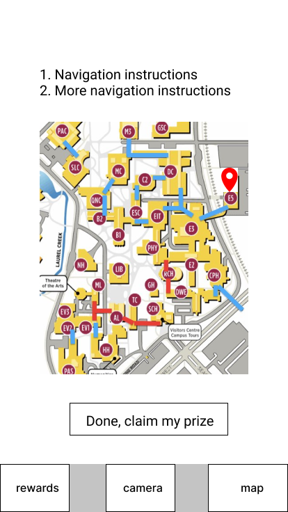
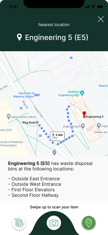
Implementing a feature that informs the user of the nearest recycle bin and perhaps navigating them to it was an important component in our solution. This would be most beneficial for first year students who are unfamiliar with the campus and for bins located outside the buildings.
User Flows
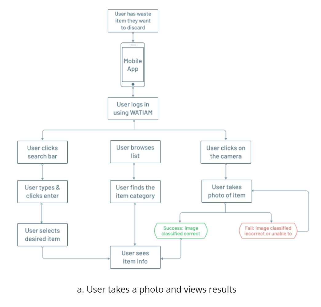
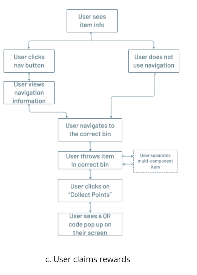
User flows were created to depict visual representations of the different pathways users can take when interacting with a product. It helped understand a users different entry points and resulted in our final actions and outcome. We created user flows for the following journeys a user can take when using our intended solution as shown below. Depicting these flows allowed us to evaluate and optimize overall layout and navigation. It was an essential step in deciding the major screens of the app.
Wireframing
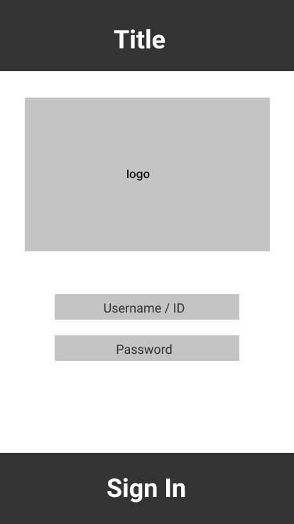
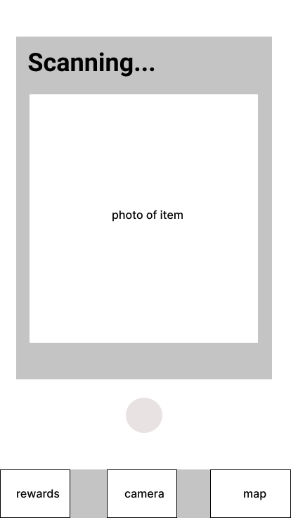
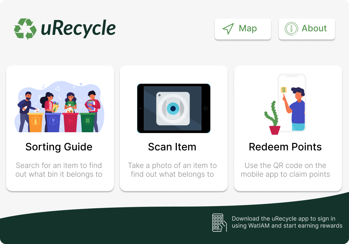
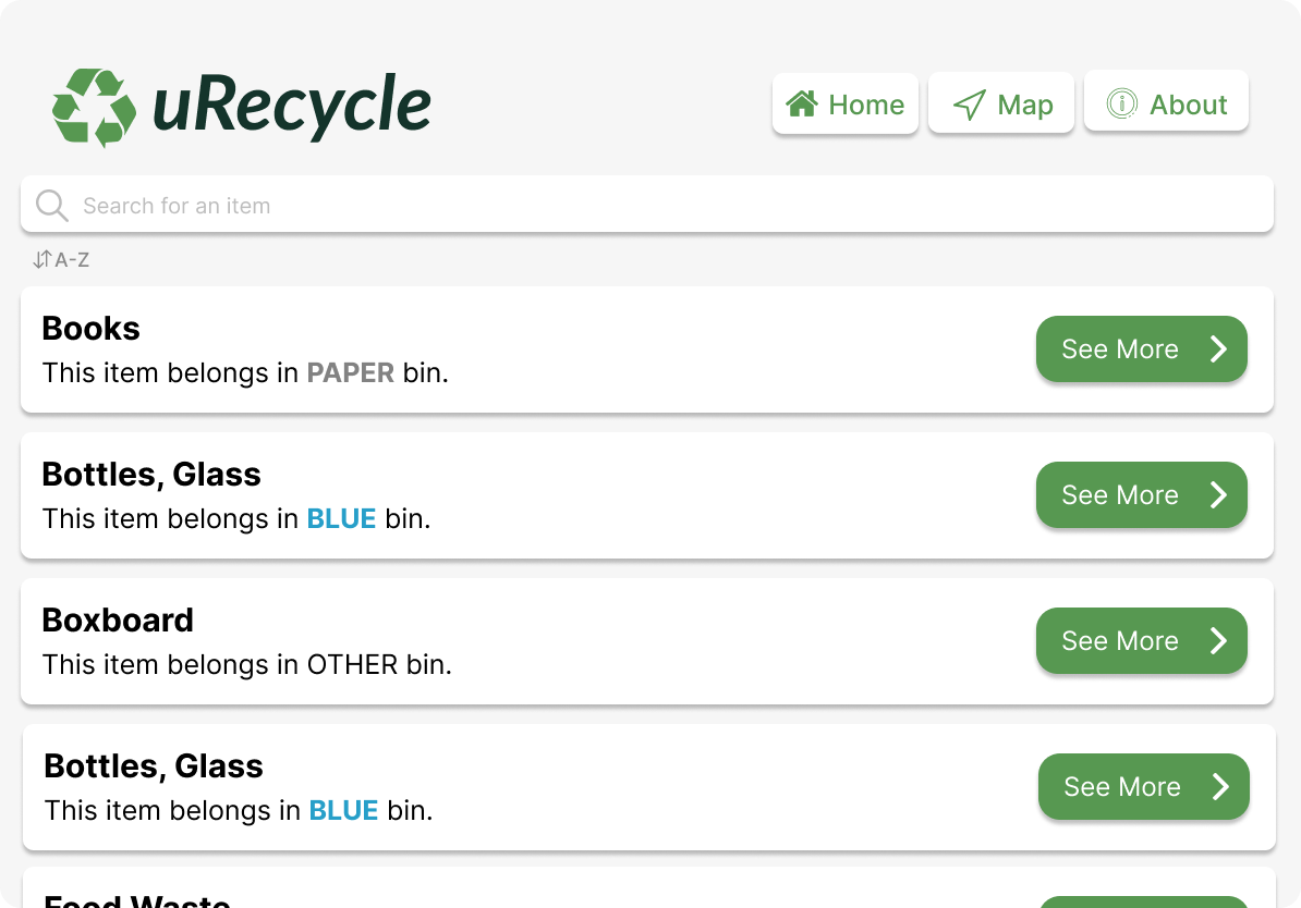
Wireframes were made to work out the application structure, function, and content. Below are the wireframes created for some of the main screens of the mobile and tablet app. The mobile screens include- the login screen, the home screen, the scanning screen, the results screen, the navigation screen, and the rewards screen. The tablet screen include- the home page, the sorting guide, the camera, and the navigation screen.
.png)
Moodboard
Moodboards guided our color palette, iconography, and overall personality of the final solution. Our goal was to figure out the moods and emotions we want to evoke for users to provide a better user experience. We found inspiring images, colours, graphics and words and created the mood board in Adobe Spark. The mood board also helped us align as a team on the visual aspects of our design. These colors represent the themes of sustainability, nature, and vegetation.
Final Solution - Mobile
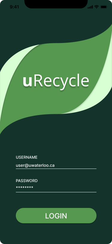
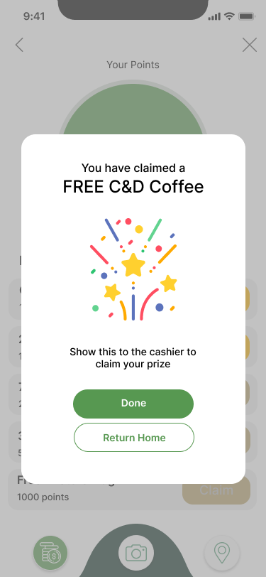
The final design solution consists of a mobile app and tablet app that work in conjunction to allow users to recycle items and redeem points using a shared database. The iPhone prototype consists of the following screens that showcase classification, search functionality, and location information. When logging in, users are navigated to the home screen where they can use the sorting guide to search through waste categories, and three buttons for classification, navigation, and rewards. The classification aspect has two components for beta testing purposes - classify images from a directory of manually added images and images captured through the iPhone camera. Once the image has been pulled and reformatted according to the specifications, a classification label is outputted to the screen to notify the user.

Final Solution - Tablet
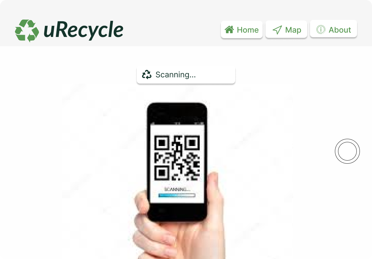
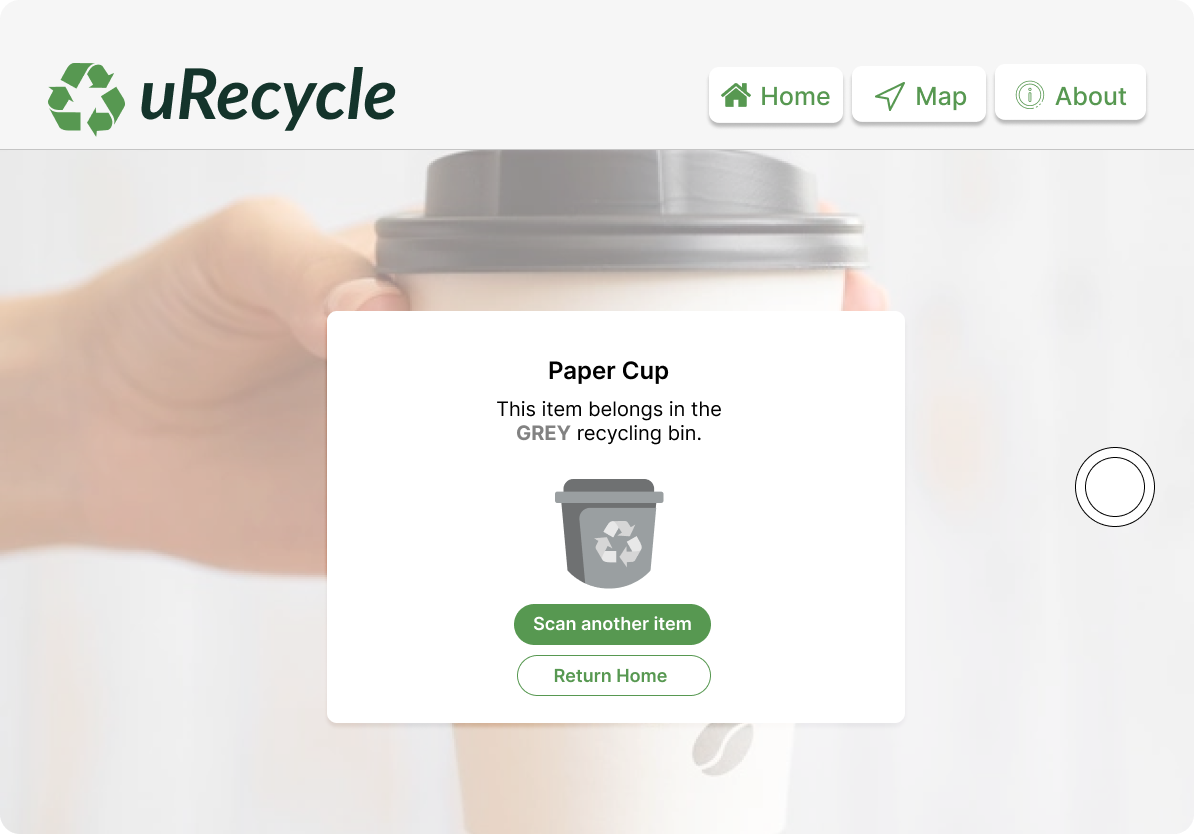
The tablet app is web-based and was built using React.js. A web application was built since web-apps can be deployed to any device with internet connection, meaning the application is not restricted to particular devices or operating systems. The web-app is intended to be deployed to a tablet with a front-facing camera and touch-screen functionality and placed on kiosk stands next to multi-stream waste receptacles. The web-app has three primary features: the recycling sorting guide, the item scanner, and the QR code scanner. The “Map” page shows users a map of the entire campus, and currently includes labelled indoor maps for the E5, E7, and DC buildings. The tablet app not only serves as an alternative to those without a mobile device, but is also essential for mobile users to redeem points. The QR scanner scans the QR code on the mobile showed by the user.
Testing
Usability Testing
User testing sessions consisted of four different scenarios, involving the major functions of both the mobile and tablet interfaces, with one scenario involving the interaction between the two. Users were asked to use the think-aloud technique. Upon test completion, a debrief session was conducted where participants were quizzed on the details of completed tasks. These post-interviews provided a way to assess the system’s ease of learning. For example, one of the tasks involved the participant showing a QR code generated within the mobile application to the camera on the tablet interface near the bins, which would result in points being added to their account. We then asked participants to describe how the point collection process works. Users also completed a post-questionnaire that consisted of 26 questions, each asking the user to indicate on a scale from -3 to +3 how they felt about the prototype with respect to a pair of words shown at either end of the scale that were categorized into one of six different scales: attractiveness, perspicuity, efficiency, dependability, stimulation, and novelty. Following the pattern from the previous usability study, the User Experience Questionnaire Handbook was utilized to set benchmarks for usability and user experience goals. The benchmarks are based on data collected from 20190 users across 452 different studies. The goal for the study was to achieve results in the 90th percentile for attractiveness, perspicuity, and efficiency, and to be in the 80th percentile for dependability, stimulation, and novelty.
Results
A total of 8 users were recruited for this round of testing. Usability goals established for this system were that it should be effective, easy to use, and easy to remember how to use. Completion rate was used to measure effectiveness, by assigning a value of ‘1’ if the participant was able to complete a task and a value of ‘0’ if not. While a completion rate of 100% is ideal, according to a study by Jeff Sauro, the average task completion rate is 78% which is based on an analysis of 1100 tasks. All participants were able to complete all the tasks giving a task completion rate of 100% which is above the benchmark of 78%. Error rate was used as a metric to measure ease of use by assigning a value of ‘0’ if the participant made no errors in the task and a value of ‘1’ if one error was made. Error rates for all tasks were low ranging from 0 to 0.25; the second task had an error rate of 0, meaning users had no issues switching from the mobile to the tablet. According to Sauro’s study, the average number of errors per task is 0.7 based on an analysis of 719 tasks. Error rates for all the tasks in this study exceed the benchmark of 0.7 with the highest error rate being only 0.25. It is important to note that these rates can vary depending on the task, since not all tasks are equally easy or difficult.